
Empowering Consistency
How I Spearheaded the Creation of Amplify’s First-Ever Student-Facing Design System, “True Blue”
About
Amplify is a curriculum and assessment company that supplies print and digital learning materials for K-12 classrooms.
Challenge
After Amplify Education acquired Desmos Classroom in 2022, the Amplify team needed:
A set of shared components to support the future of the Amplify Desmos Math student experience.
Design and engineering guidance for seamless implementation of the new design system.
A shared understanding of how to design for developmental differences among K-5 students (ages 5-10 years).
Impact
In collaboration with two other designers, we delivered 19 high-priority components for engineering development. I created a design system onboarding guide for designers, as well as a “Designing for Kids” how-to guide.
My Role
UI Design, UX Design, Stakeholder Management
Team
Me as 1 of 2 UX designers, 1 tech lead, 1 UX researcher, 13 engineers, and 20+ internal stakeholders
Timeline
July 2023-July 2024
Overview
✅ Results
I supported the establishment of Amplify’s “True Blue” K-5 design system, which aimed to accommodate the needs of elementary students using the Amplify Platform.
I helped assemble aFigma library of age-appropriate colors, icons, typography, and components.
I created a design system implementation guide to support my team.
📈 Impact
The styling themes were successfully implemented within the unified K-5 Amplify Desmos Math product pilots in Fall 2024.
The design system is now supported by a team of designers who have delivered 55+ design components.
Design Process
🔍 Auditing Existing Components
I reviewed Amplify’s K-5 student-facing components in their 2023 product suite to identify color palettes, component styles, and typography usage.
📚 Researching Design Best Practices for Kids
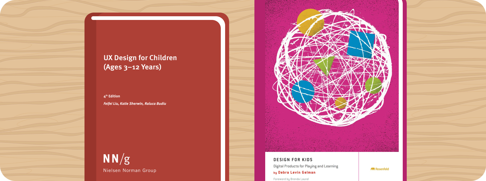
To prepare myself for this project, I read "UX Design for Children (Ages 3-12)" by Nielsen Norman Group and "Design for Kids: Digital Products for Playing and Learning" by Debra Gelman. Before kicking off this project, I shared my takeaways and learnings with the design team to align on the needs of the young users we were designing for.
Key Project Decision:
Design, engineering, and product leads utilized findings from my research to determine that the “True Blue” design system should consist of three grade band themes: K-1, 2-3, and 4-5. This would enable us to make appropriate sizing, spacing, and styling modifications to meet the developmental needs of each age group.
Grade Band “Theme” Differences
The “True Blue” design system is unique because it is split into three different grade band “themes”, which consist of components, spacing, and sizing specifications most appropriate for users based on each student grade band’s developmental needs and preferences.

K-1:
Pre-Readers, New Tech Users
Raised Buttons / Illustrated Icons
Use “raised” skeuomorphic buttons and illustrated icons to support the developmental needs
Requires the largest spacing between components, and extra large touch points to prevent tiny human error.
2-3: “Less Baby-ish” Early Readers
Raised Buttons / Standard Icons
Use “raised” skeuomorphic buttons
Preferred “standard” icon style — While this age group had similar needs to K-1, play-testing feedback revealed that this age group did not like the illustrated icons because they wanted something ‘less baby-ish”.

4-5: Growing into Adult UI/UX
Flat + Ghost Buttons / Standard Icons
Prefers to be as “adult” as they can. This age group is more familiar with the conventional UI/UX patterns we use as adults.
They use a combination of flat and ghost style buttons as well as standard icon styling.
Future hopes to bridge styling gaps between grades 5 and 6
🎨 Defining Color Palettes
The first step of this work was for me to define color palettes that would support the design of initial components.
I selected colors that:
Exceeded sufficient contrast for readability
Aligned with Amplify's brand identity
💬 Typography for Young Students
The typography system we chose was designed to optimize readability for children while considering the challenges that young readers may face with complex text. Typography components we created included: Headings, text blocks, and labels.
Initial K-5 Icon Library
Below is the initial set of icons I developed in collaboration with an illustrator.
A Note on Illustrated K-1 Icons
Since K-1 students are still learning how to use technology, they interact with digital tools using the schema as they do with real-world objects. To support our youngest learners as they make sense of our digital tools, we have illustrated icons that resemble real-world objects. Not all icons will have an illustrated version, but rather those that are “used as a metaphor” (ex. Home)
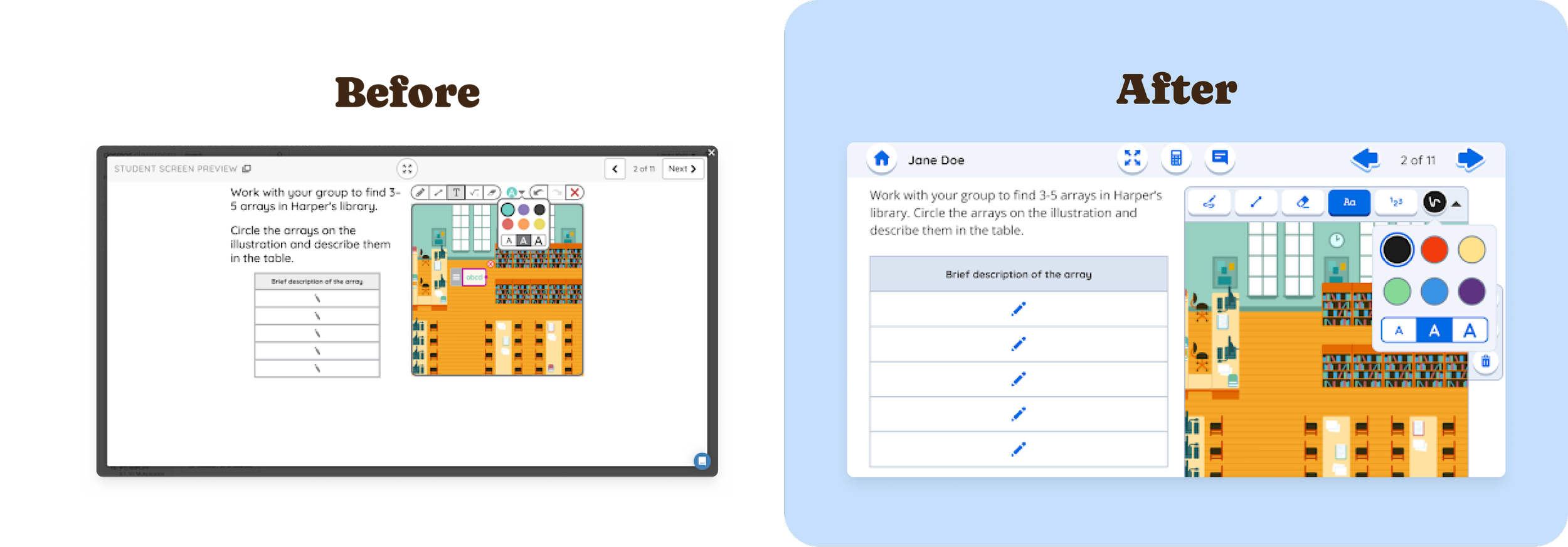
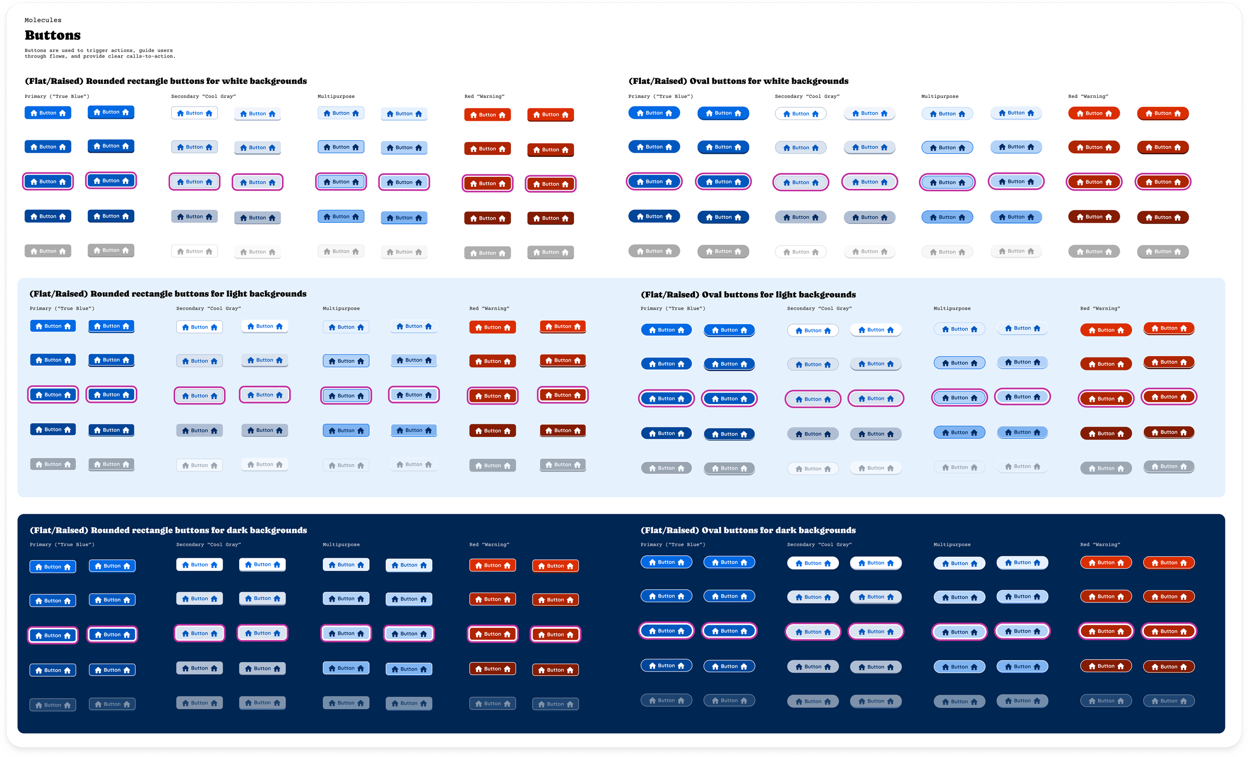
Defining Button Styles
I worked with the tech lead to design button variations based on two primary factors: the intended grade band of the end user (which impacted sizing and style) and the background color behind the button (white, light, or dark). We also included variants for default, hover, active, and disabled states.
✏️ Co-designing Additional UI Components
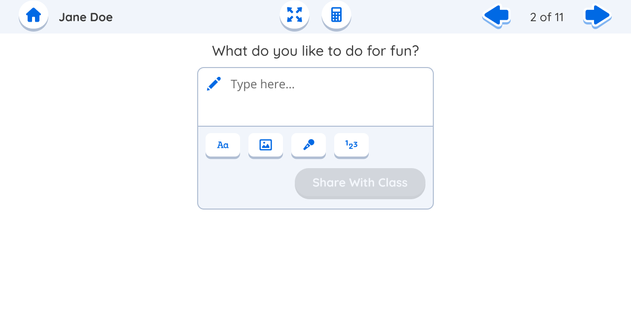
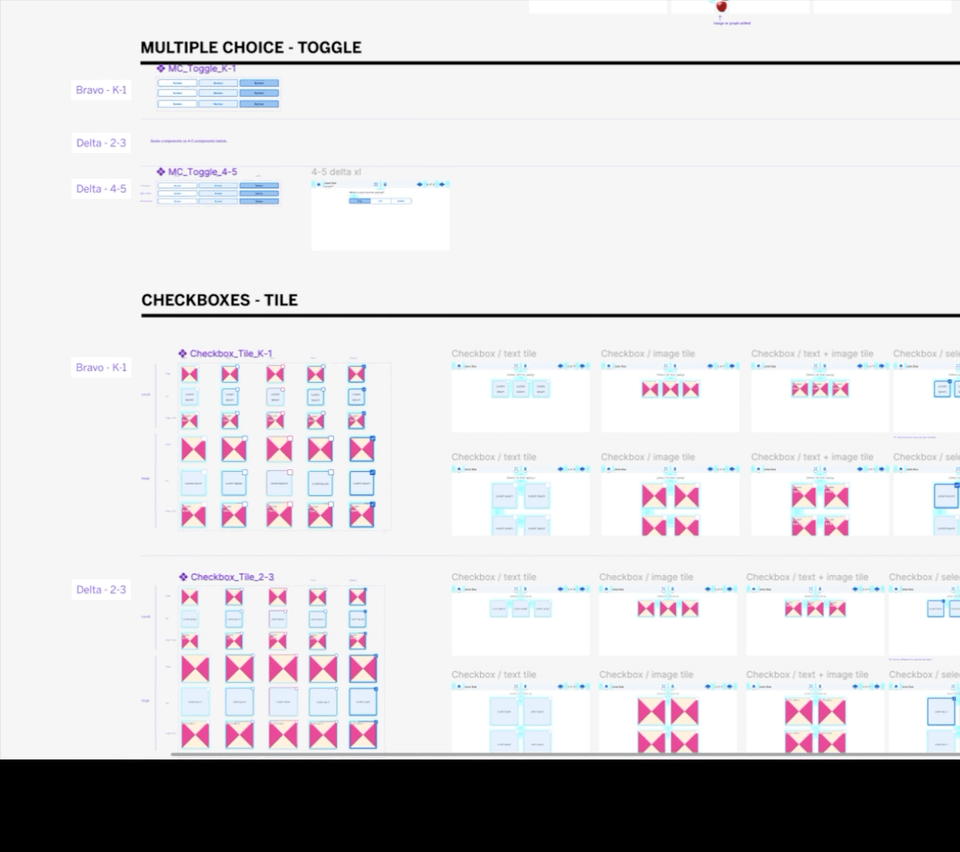
In collaboration with other team members, I co-designed several additional components, including form fields, input buttons, and interactive elements.
Table Component
Checkbox Tiles

Free Response Component
Card Sort Component
Ordered List Component
Sketch Component
Multiple Choice Component
Math Response Component
Component Testing and Iterations
As we designed Figma components for each grade band (K-1, 2-3, 4-5), we also partnered with a user researcher to batch test multiple components at a time within a single prototype.
Design Handoff to Engineers
After each component had been user tested and had gone through an accessibility audit through our WCAG (Web Content Accessibility Guidelines) approved partner, I would support the primary designer with getting them developer-ready in Figma.
I learned the importance of including spacing and layout guides, and of leaving developer notes on desired responsive behavior.
📄 Creating Documentation for Design Team
I collaborated with another designer to create two resources for the broader design team:
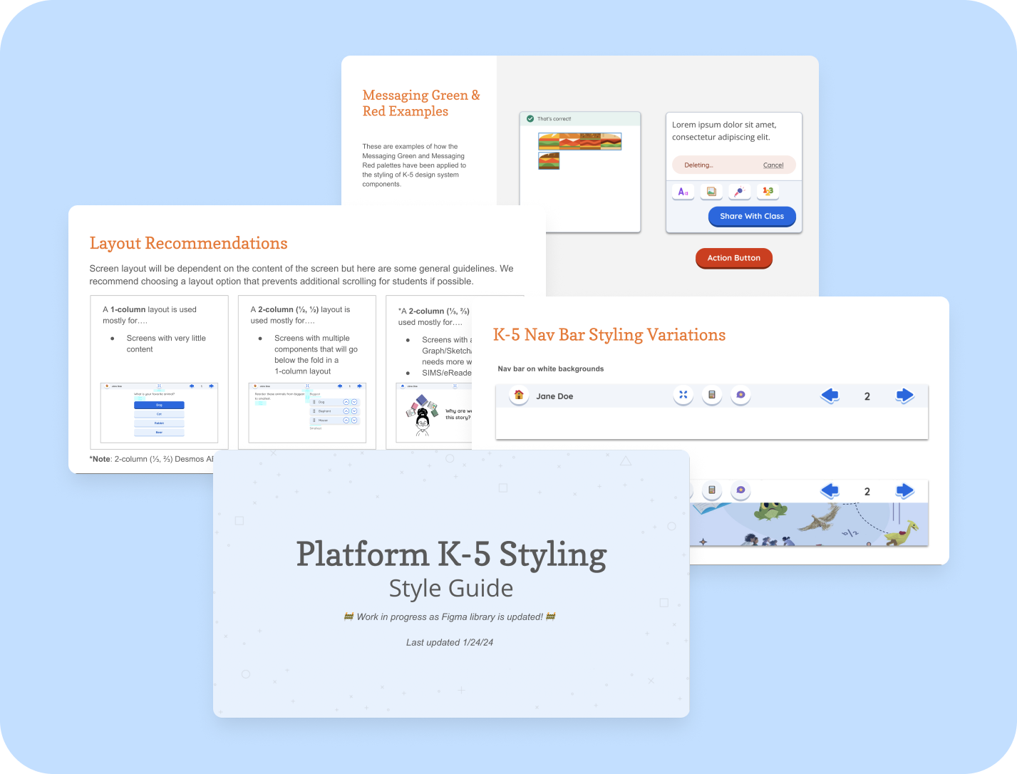
A comprehensive style guide, outlining proper usage of K-5 styles and components
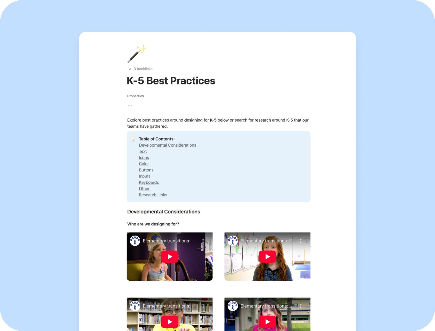
A K-5 best practices resource, outlining age-appropriate UI/UX best practices for K-5 design projects.
These documents have grown into essential reference guides for current and future team members working on the student-facing designs.
Final Results & Learnings
💡 Key Takeaways
Strong partnerships with a user research team can help guide the design iterations of multiple components simultaneously.
Designing for kids’ developmental differences sometimes requires a bit of research to understand, but Nielsen Norman Group has extensive resources on this topic.
Including developers early in conversations can help prevent decisions that lead to technical debt. Design smarter, not harder!
More Projects
Amplify Assign Redesign
I led a design initiative focused on redesigning the digital assignment experience for teachers on an Edtech platform.
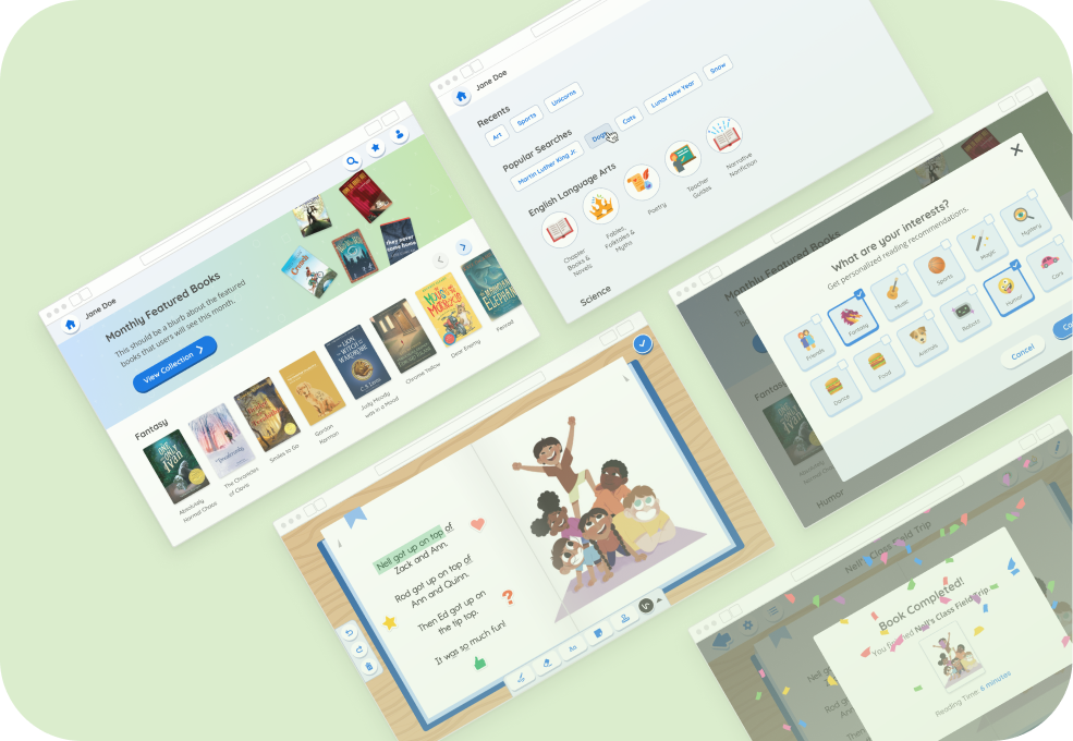
Designing an Elementary Student Reading Experience
I employed qualitative research to visualize the needs of teachers for a K-5 digital library and eReader experience.